Overview
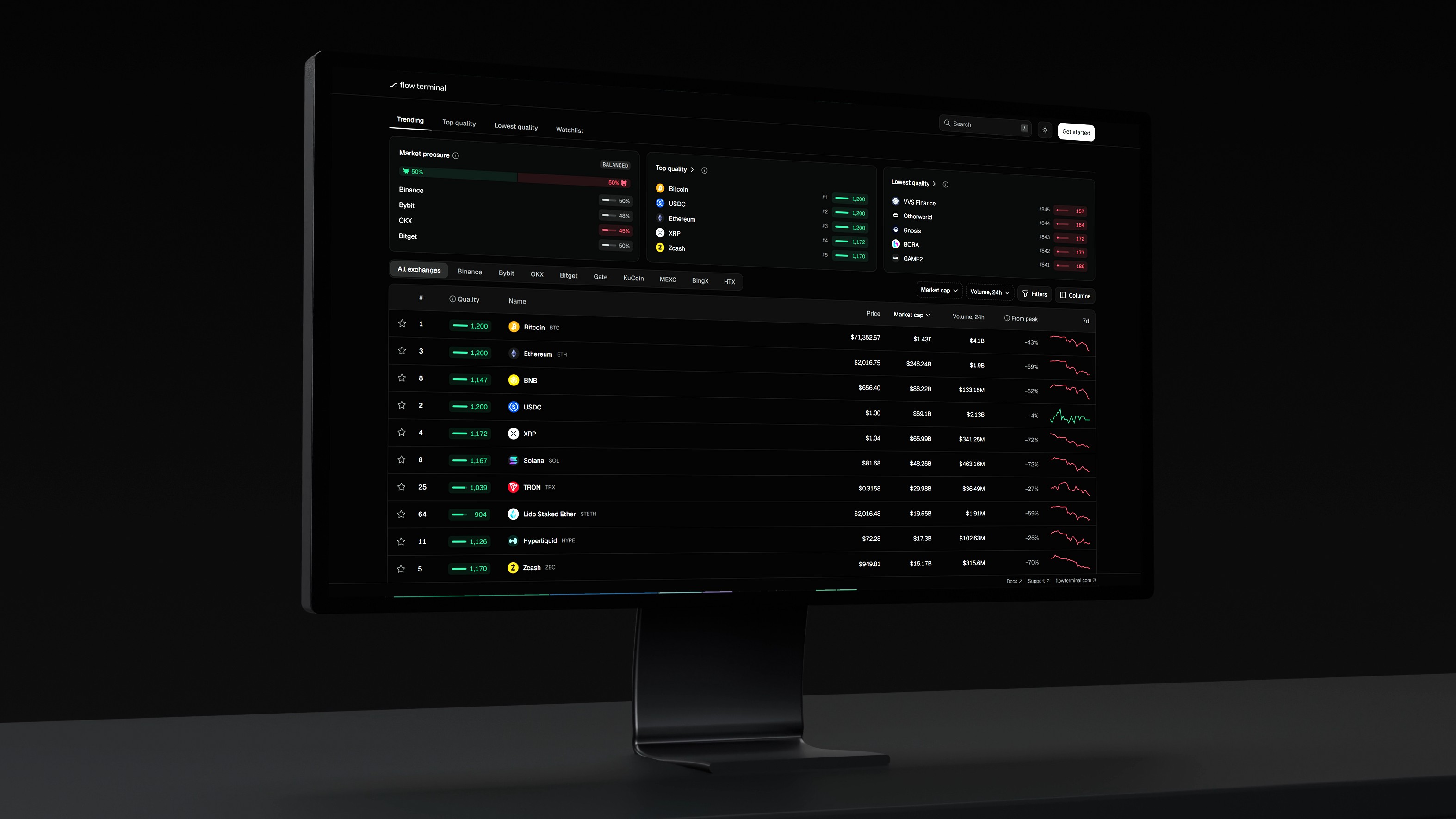
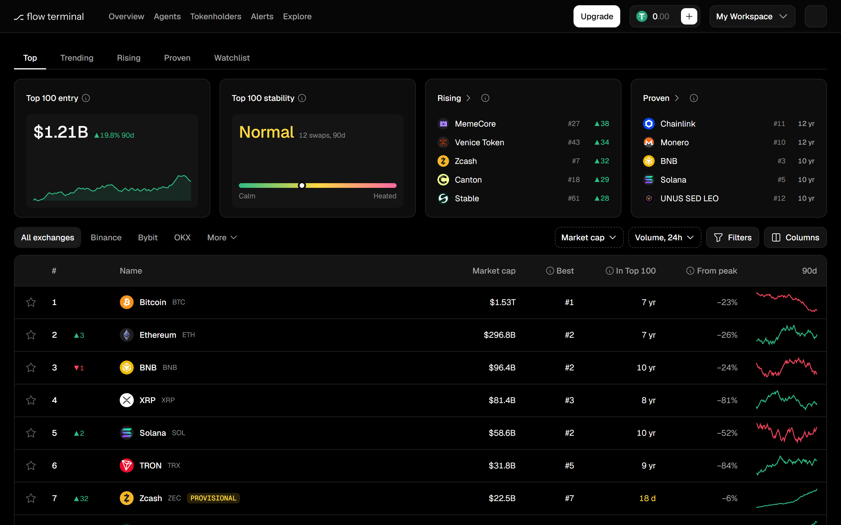
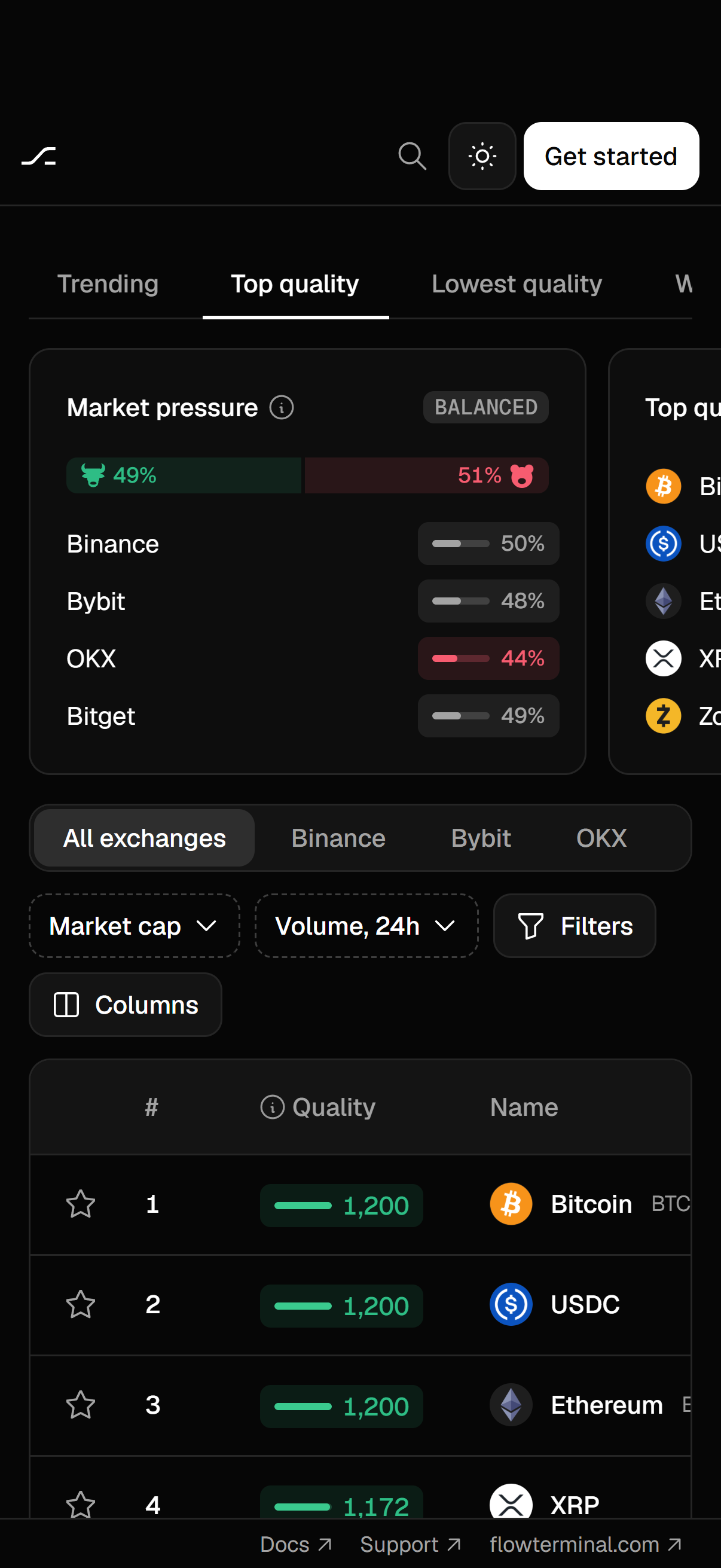
A public token ranking anyone can open without an account. It replaced the old landing page, so it's the first thing a new visitor sees. I kept CoinMarketCap's layout on purpose and broke from it only where it leaves a gap. I designed the table and the token page, and built the frontend.
Outcome
Running on live data, not launched yet. I'd watch two numbers: investors who come back within a week, and token teams who press Get started.
Big doesn't mean you can sell
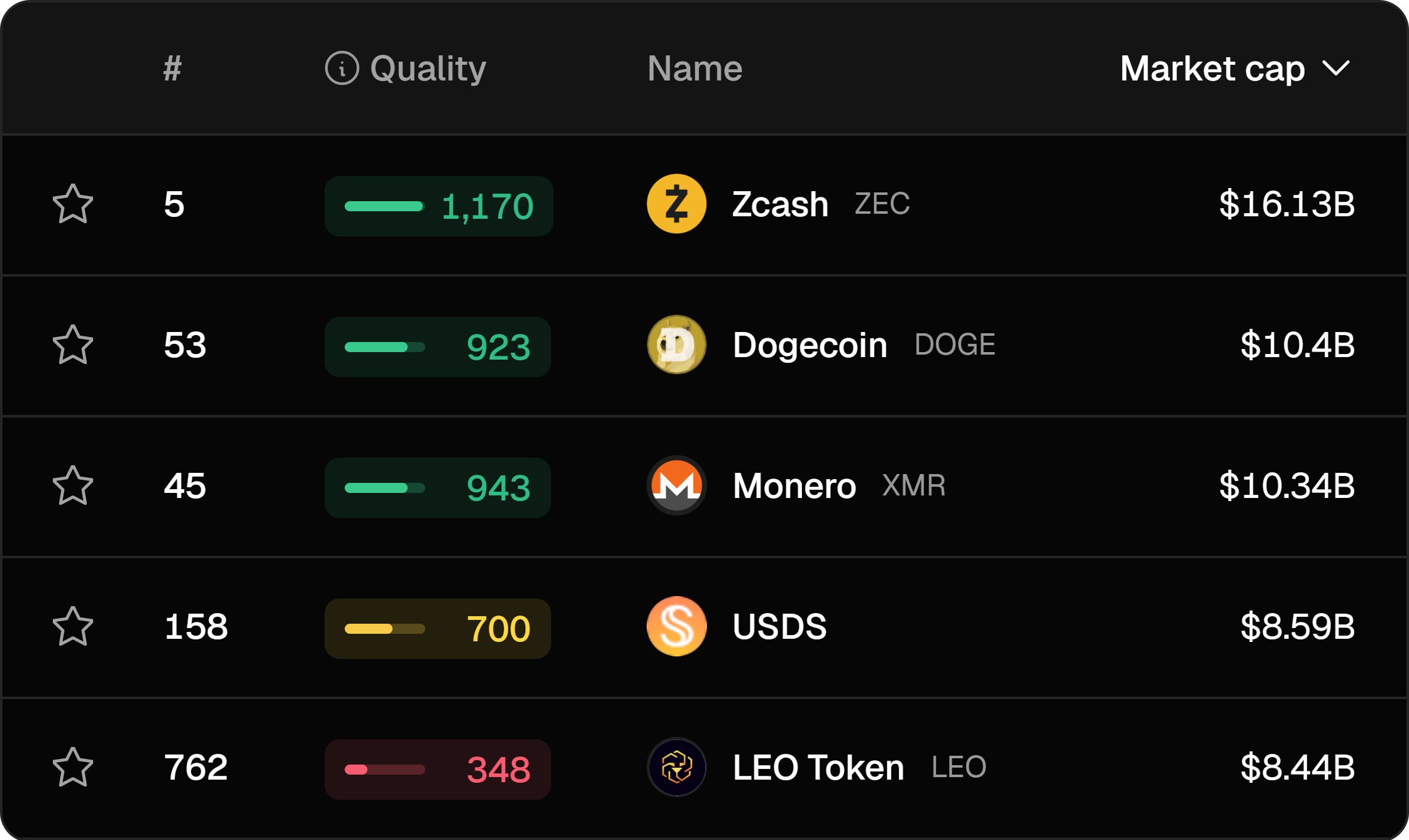
CoinMarketCap ranks tokens by market cap. A big cap tells you nothing about whether you can sell without moving the price.
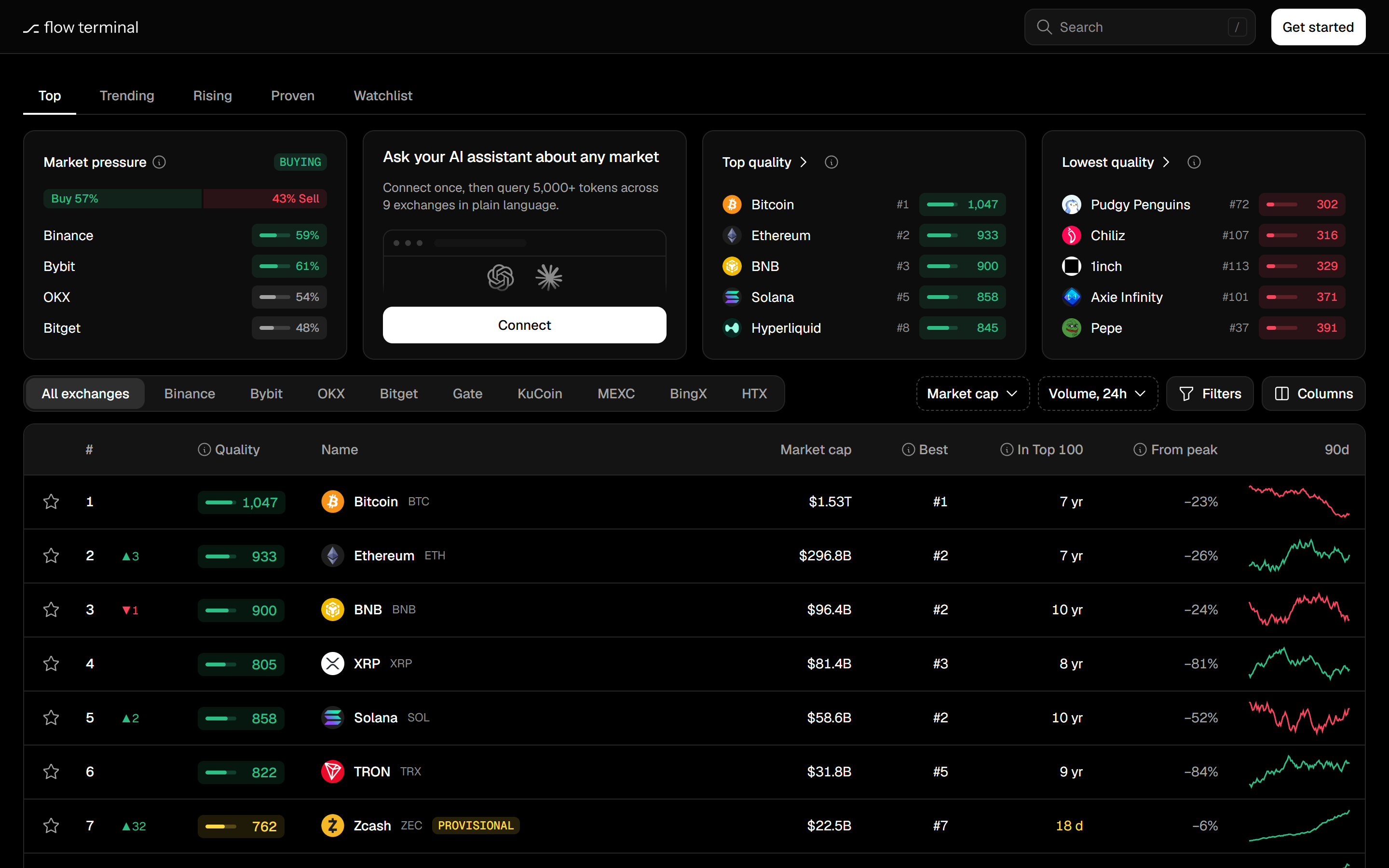
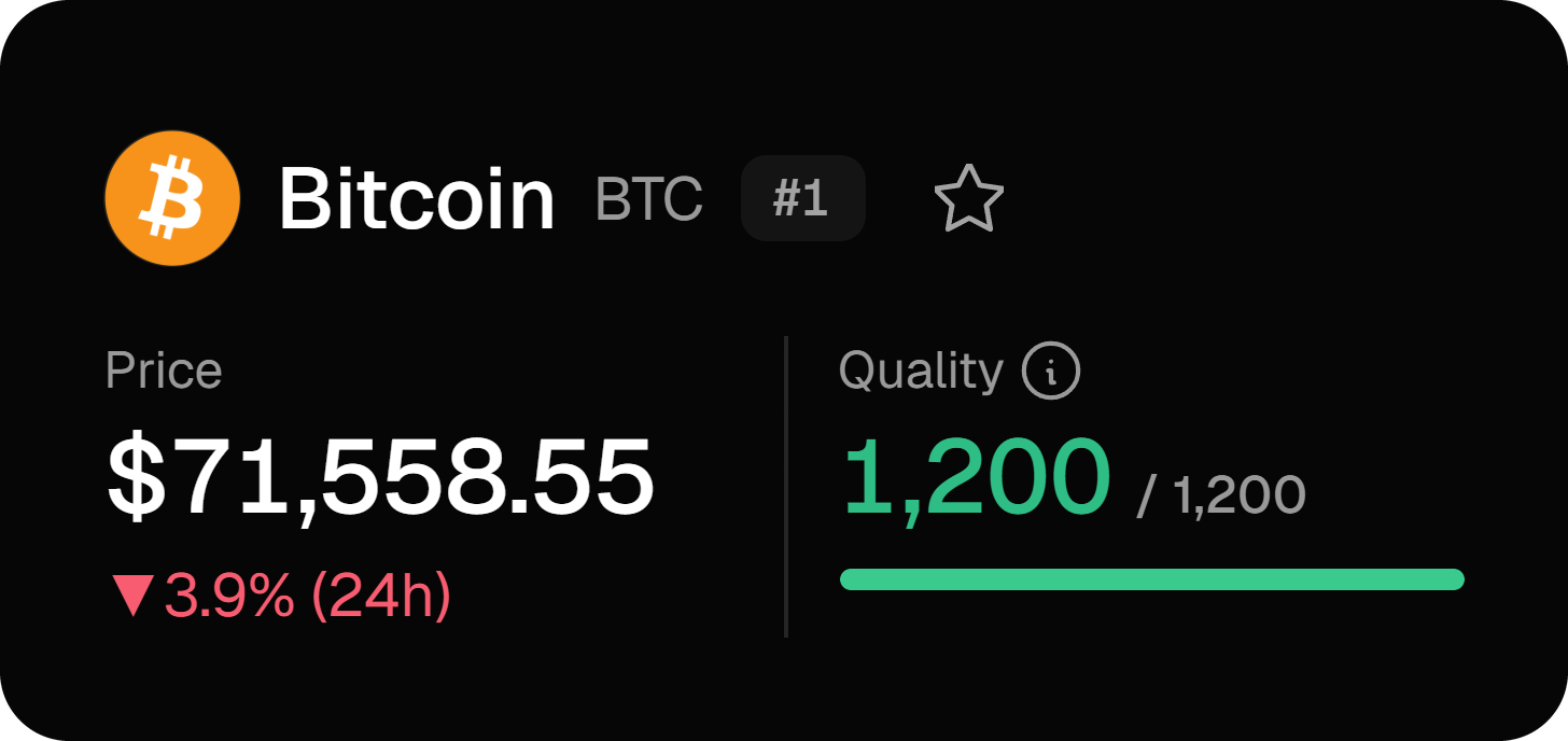
Quality is a score out of 1,200 from spread, depth and volume. I kept the cap ranking, because that's what people are used to, and pinned Quality before every name, so you see both before you click.
Only what CoinMarketCap doesn't have
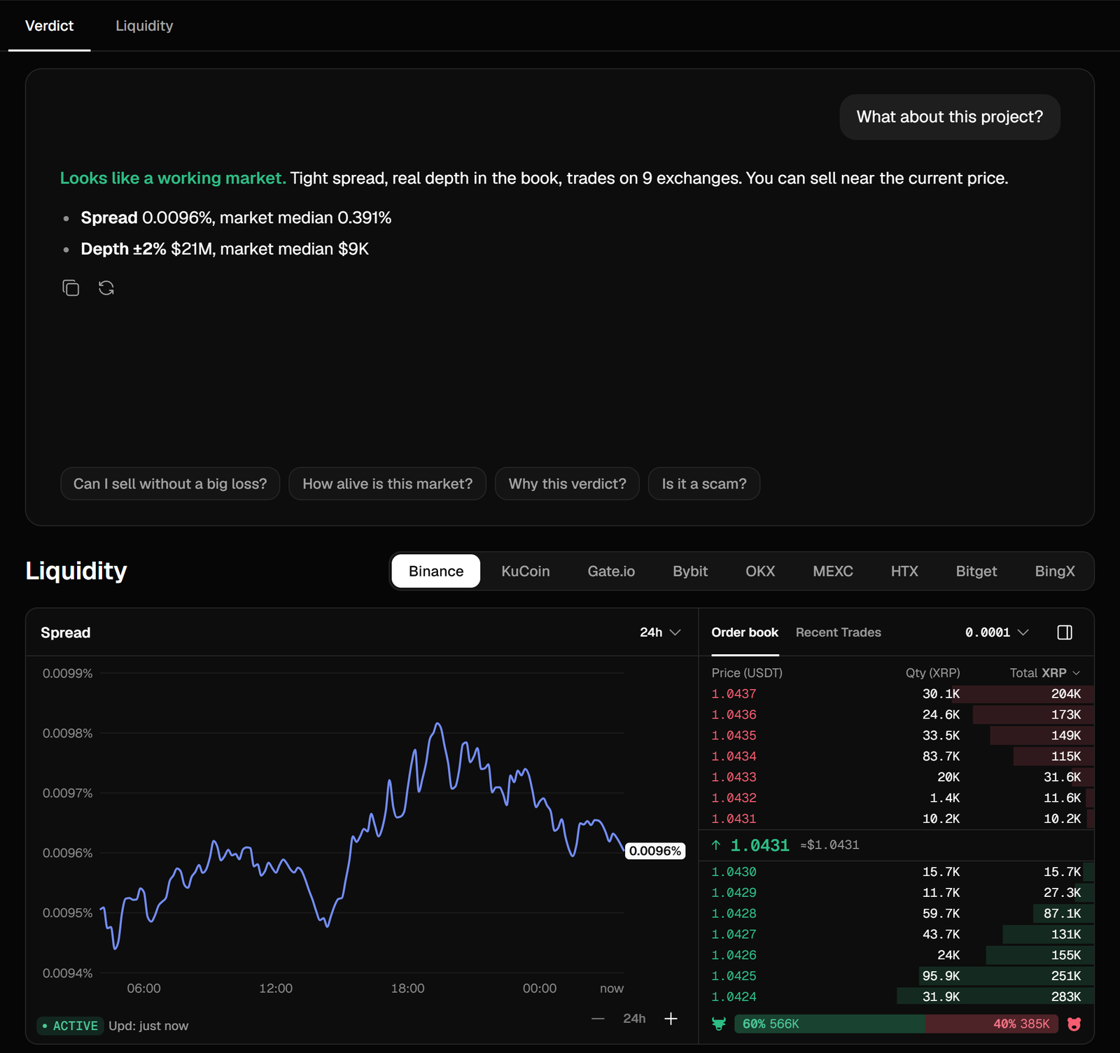
The first token page repeated what CoinMarketCap already shows, so I cut four sections.
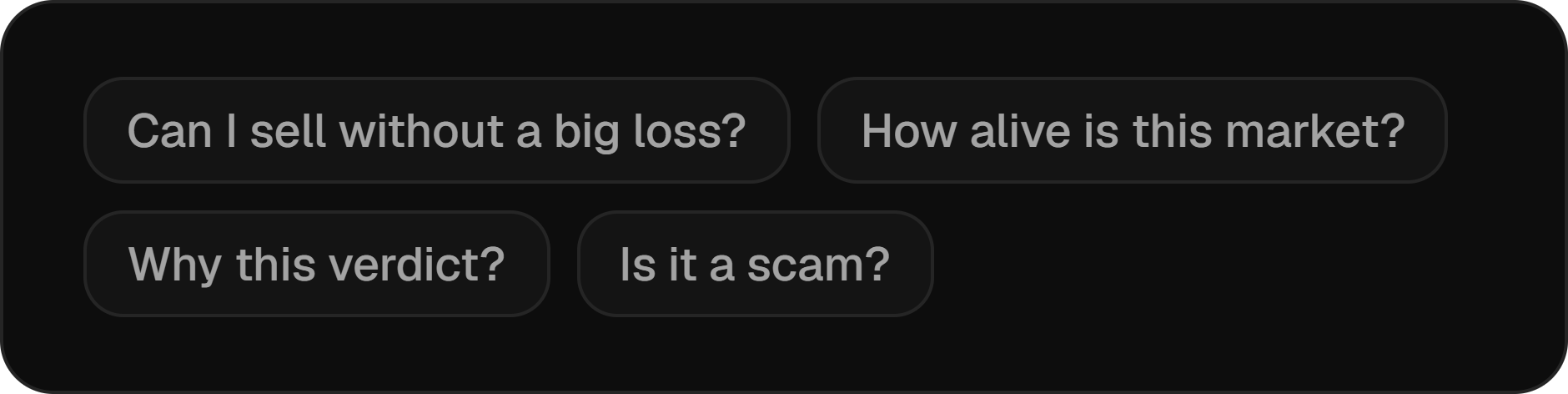
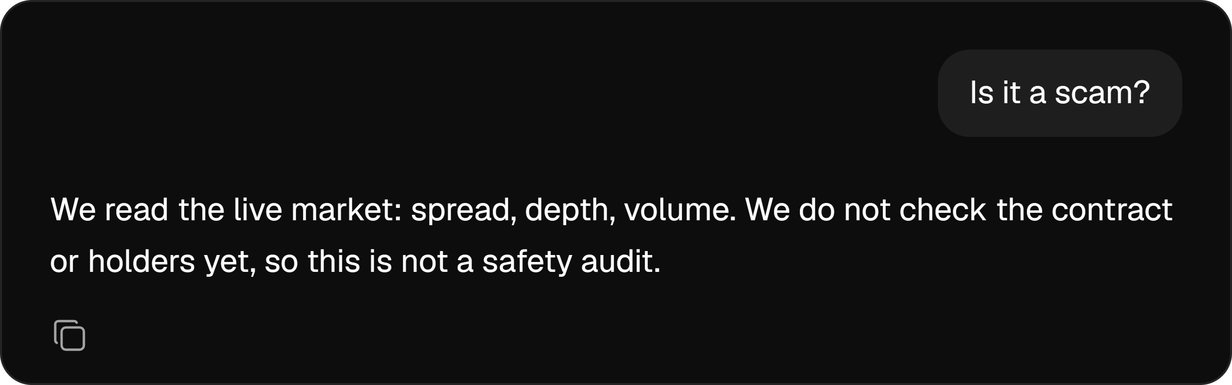
In their place I put a verdict that reads like a chat. It types out its answer, offers ready questions and says plainly what it doesn't check, like the contract and the holders.
Markets had two jobs: help an investor judge a token, and bring token teams to Flow Terminal. Whatever CoinMarketCap already does well, we left to them.
No sign-in wall
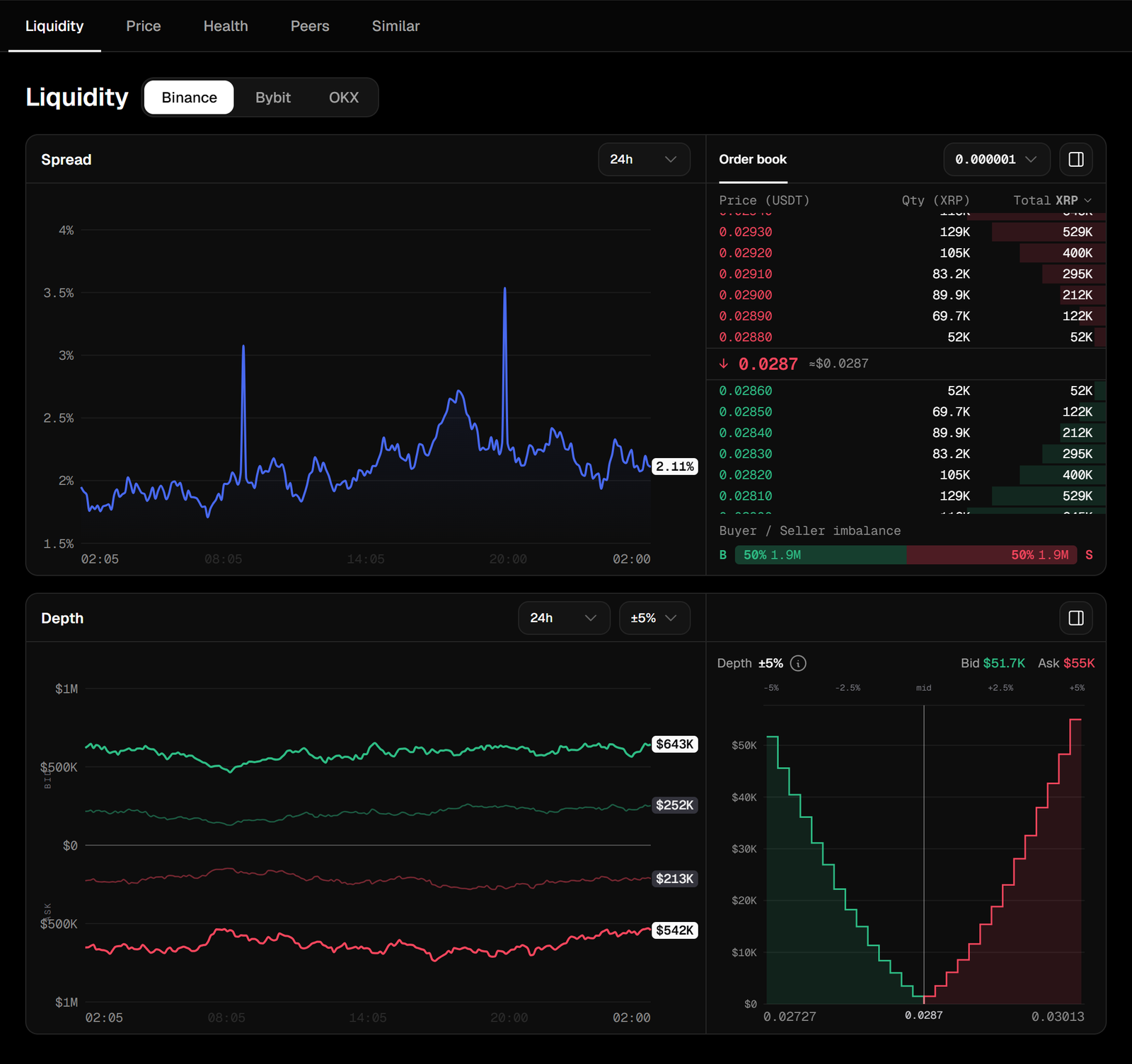
Most of Flow Terminal sits behind a login. Markets is for people who've never heard of us, so a guest gets all of it, with one button: Get started.
The rest of the app stays behind the login. Investors come for tokens, and market making means nothing to them.
A first-time visitor won't wait, so I kept the table light: about 2,400 elements on the page instead of 49,000, and a repeat visit opens in 0.2 s instead of 4.2 s.

What I'd measure.
Markets has two kinds of visitors: investors, who'd never pay us, and token teams, who would.
For investors I'd watch one number: do they come back within a week. If they don't, Markets isn't worth opening, and it won't bring anyone to Flow Terminal either.
Token teams are the point. The next step was a block on every token page: what holds its Quality back, like thin depth or a wide spread, and which agent fixes it. I'd count how many people open that block, and how many of them press Get started.
If plenty open it and nobody signs up, the pitch is wrong. If nobody opens it, token teams aren't on Markets at all, and we'd go find them somewhere else.