Overview
When I took over the frontend in July 2026, colors and sizes were typed by hand, screen by screen. I moved them into one tokens file, replaced 130 hand-typed colors and fixed 390 sizes that were off the 4 px grid. Then I built the shared parts on top: fields, menus, buttons and loading states. In October the kit went into Figma: 57 styles and 112 icons.
One name, two themes
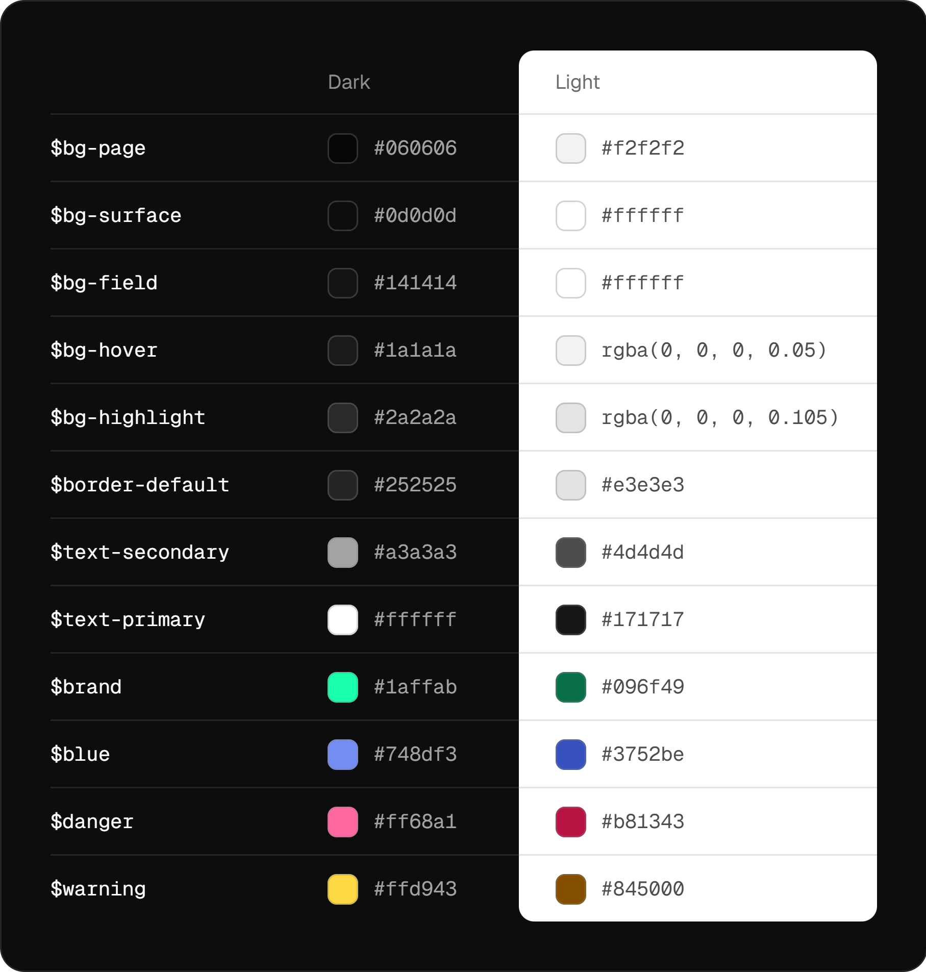
Every color comes from the tokens file. Backgrounds climb one ladder by brightness, from the page to cards, fields and hover, so a new surface picks a step instead of inventing a gray.
When the light theme came in October, it was a second set of values under the same names, checked for WCAG contrast.
Sizes are multiples of 4, and anything you can click is at least 32 px. Icons come from one set with one stroke width and take the color of the text next to them.

Shared fields, menus and buttons
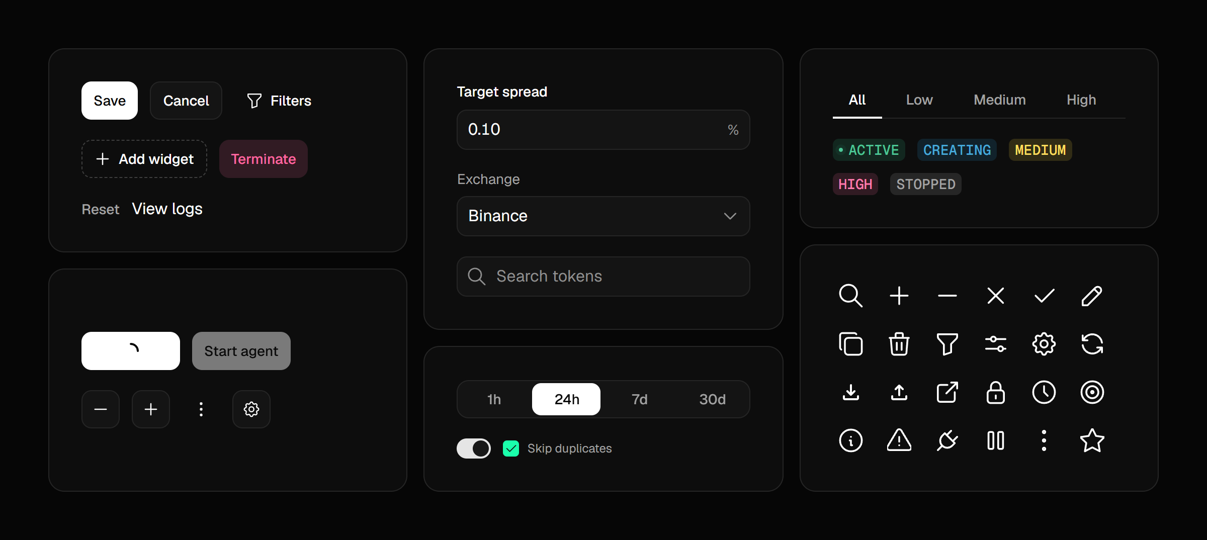
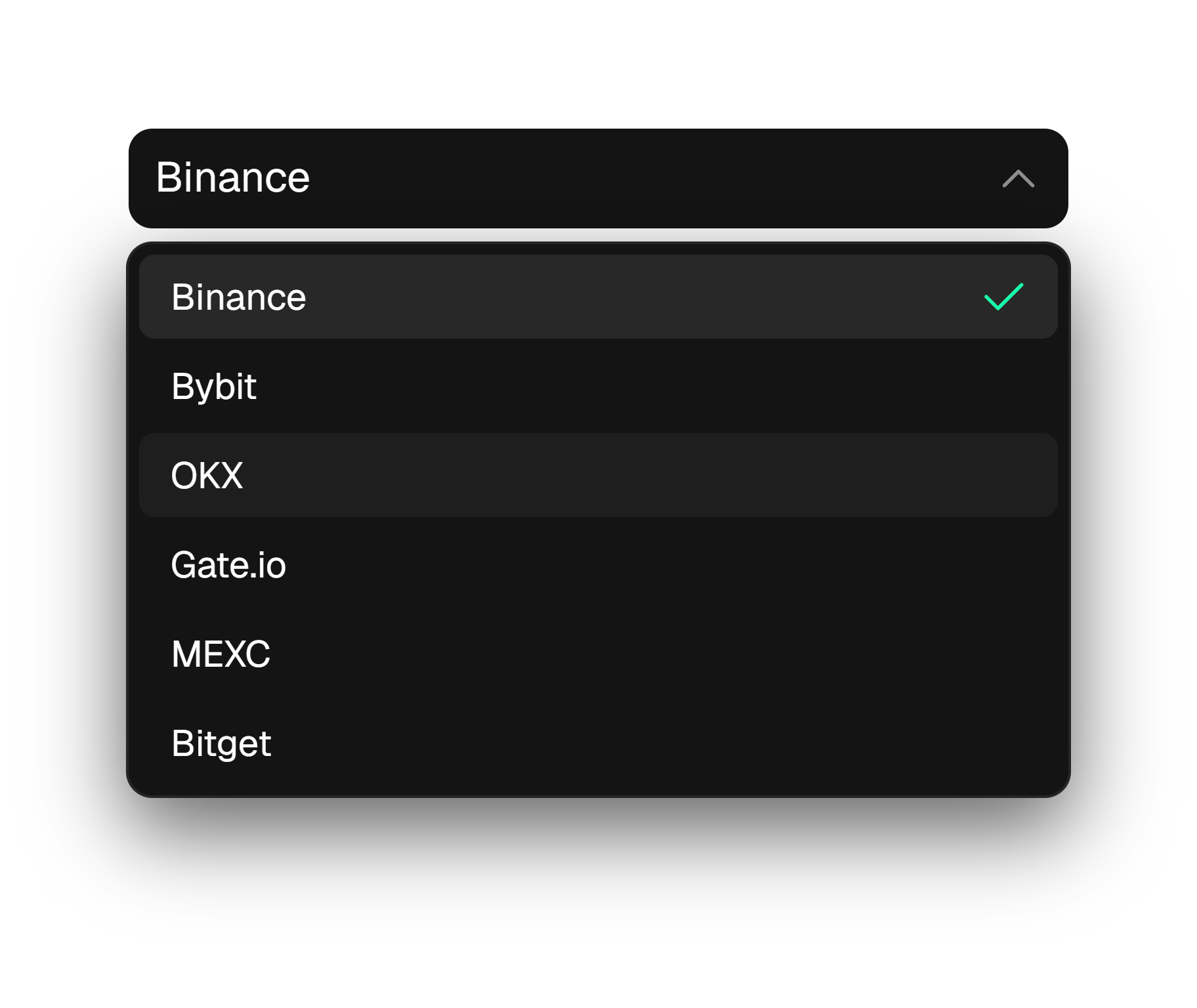
Every input, dropdown and search field is drawn by one shell, so they share height, border, hover and focus. Every menu is one component too.
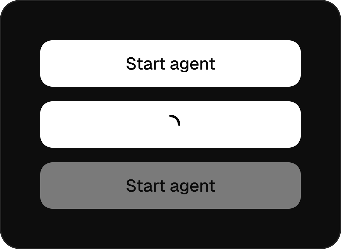
In October I brought buttons down to seven variants. A disabled button is the same button at 45% opacity. A loading one keeps the width of its label and shows an arc, so nothing next to it moves.

Charts load in place
While a chart loads, its place fills with glyphs in the chart's own outline. When the data arrives, the numbers and the line build up out of the same glyphs right where they'll stay, so nothing jumps.
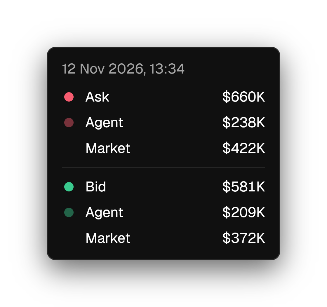
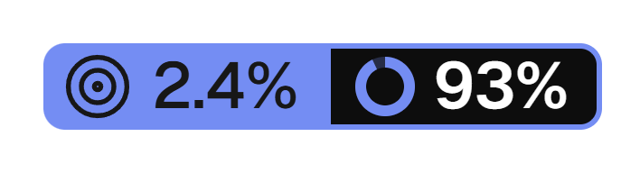
Chart tooltips share one layout: the time on top, then a dot, a name and a value on each line. A target sits on the axis in a pill, with its uptime next to it.
An automated check renders 28 screens in 4 states at 2 widths, so a broken loading or empty state shows up before a user sees it.